In Part 3 of Building a Custom Block, we’ll update our Edit component to support child blocks (InnerBlocks) and add our own custom Inspector Controls to toggle the dismiss button.
In Part 2, we defined our block supports and added our first custom attribute (isDismissible). Now it’s time to actually do something with that attribute and give users a way to change it. Additionally, we want to allow users to place other blocks inside our block. Blocks inside of other blocks are referred to as “inner blocks” or “child blocks”.
In order to accept inner blocks, we need to tell the block’s edit and save components to display and save them. Let’s start by updating the Edit component to support child blocks.
Adding Inner Blocks
In order for our block to store and render inner blocks, we need to use either the InnerBlocks component or the useInnerBlocksProps hook. They’re both very similar, but the hook allows you to control the resulting markup more and in general I’d recommend you use it instead of InnerBlocks.
Next we need to import the useInnerBlocksProps hook from @wordpress/block-editor and render it inside our Edit component. Let’s update the edit.js file:
import { __ } from "@wordpress/i18n";
import { useBlockProps, useInnerBlocksProps } from "@wordpress/block-editor";

export default function Edit({ attributes, setAttributes }) {
	const blockProps = useBlockProps();
	const innerBlocksProps = useInnerBlocksProps();

	return (
  	<div { ...blockProps }>
  		<div {...innerBlocksProps } />
  	</div>
	);
}If your block has inner blocks, the HTML element that wraps those should be a block element like a div (vs, say, a paragraph tag like it was by default) to ensure the HTML is valid. We spread the values of the variables to automatically set all of the props inside of them on the div tags.
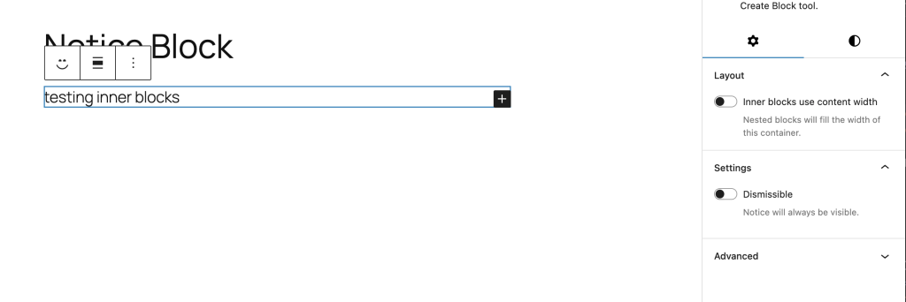
If you refresh the editor and insert a Notice block now, you should see an empty container with a block appender inside:

From here you can add inner blocks and they’ll display inside of the notice block. Boom!

If you try to save the page, the inner blocks will be erased. This is because we need to tell our block to save the inner blocks along with the rest of the markup.
Updating the Save Component
We’ll need to update the block’s save component in save.js to use the useInnerBlocksProps hook as well. This time we’re going to use the save function from both useBlockProps and useInnerBlocksProps instead of just calling the hook directly.
Since this is the save component, we don’t want to store any attributes that are specific to the editor in our saved markup. Using the save function allows us to get only the frontend markup, which by default includes the block’s HTML class name: wp-block-lwpd-notice.
Open save.js and update it to use the new hook:
import { useBlockProps, useInnerBlocksProps } from '@wordpress/block-editor';

export default function save() {
	const blockProps = useBlockProps.save();
	const innerBlocksProps = useInnerBlocksProps.save();
	return (
		<div { ...blockProps }>
			<div { ...innerBlocksProps} />
		</div>
	);
}
Once you make this change and save, refresh the editor, add some blocks to the notice block and save the page. When you refresh, you’ll see those inner blocks there as expected.
Configuring Inner Blocks
As of now, our block starts off completely blank and allows us to insert any blocks we want inside of it. In some cases, you may want to restrict what a user can add or maybe pre-fill the block with a few inner blocks of its own.
You can set what blocks are allowed inside of block.json using the allowedBlocks key. For our Notice block, we’ll just let users insert whatever blocks they want for now. We can always come back and change this later if needed.
It would be nice to set a few blocks in there by default when someone adds the Notice block to a page. This can be done using the template prop for useInnerBlocksProps.
A block template is an array of arrays that contain at least 2 items: the block name string and an object of block attributes. If the block itself has child blocks, those children would be the third item in the array.
const TEMPLATE = [
	[
		'core/heading', // Block name
		{ content: __('Notice title', 'lwpd') } // Block attributes
	],
	[
		'core/paragraph', // Block name
		{ content: __('Add notice content…', 'lwpd') // Block Attributes

		}
	]
];So we can set our template variable and then pass that into the options object of the useInnerBlocksProps hook:
import { __ } from "@wordpress/i18n";
import { useBlockProps, useInnerBlocksProps } from "@wordpress/block-editor";
const TEMPLATE = [
['core/heading', { content: __('Notice title', 'lwpd') }],
['core/paragraph', { content: __('Add notice content…', 'lwpd') }]
];
export default function Edit({ attributes, setAttributes }) {
const blockProps = useBlockProps();
const innerBlocksProps = useInnerBlocksProps(
{},
{
template: TEMPLATE
}
);
return (
<div {...blockProps}>
<div {...innerBlocksProps} />
</div>
);
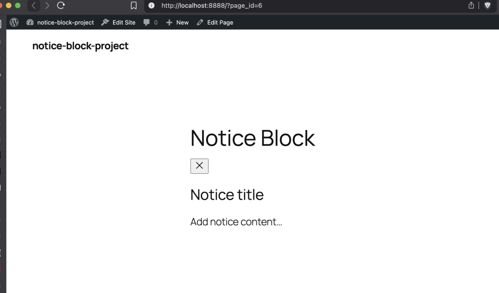
}Now if you go insert another Notice block, you’ll now see the heading and paragraph blocks included by default:

Adding Inspector Controls
Now let’s tackle the fun part: giving users a way to toggle the isDismissible attribute. To do this, we’ll add our own inspector controls to the block’s sidebar panel. Inspector Controls are the settings you see in the right sidebar when a block is selected. WordPress provides a component for this that lets us inject our own controls into that panel.
The name “Inspector Controls” comes from the react component that houses all of the controls: InspectorControls. You add this component to your block’s edit component and then include the controls you’re building as children of the component. The component accepts a prop that determines what area of the Inspector Controls output your controls (or content) will appear in.
Now we’ll update edit.js to include InspectorControls and a few other components we need:
import { __ } from "@wordpress/i18n";
import { useBlockProps, useInnerBlocksProps, InspectorControls } from "@wordpress/block-editor";
import { PanelBody, ToggleControl } from '@wordpress/components';
const TEMPLATE = [
	[
		'core/heading', // Block name
		{ content: __('Notice title', 'lwpd') } // Block attributes
	],
	[
		'core/paragraph', // Block name
		{ content: __('Add notice content…', 'lwpd') // Block Attributes

		}
	]
];
export default function Edit({ attributes, setAttributes }) {
const { isDismissible } = attributes;
const blockProps = useBlockProps();
const innerBlocksProps = useInnerBlocksProps(
{},
{
template: TEMPLATE
}
);
return (
<>
<div {...blockProps}>
<div {...innerBlocksProps} />
</div>
<InspectorControls>
<PanelBody title={__('Settings', 'lwpd')}>
<ToggleControl
label={__('Dismissible', 'lwpd')}
help={
isDismissible
? __('Users can dismiss this notice.', 'lwpd')
: __('Notice will always be visible.', 'lwpd')
}
checked={isDismissible}
onChange={(value) => setAttributes({ isDismissible: value })}
/>
</PanelBody>
</InspectorControls>
</>
);
}Let’s recap what we’ve changed here:
- We import
InspectorControlsfrom@wordpress/block-editorandPanelBodyandToggleControlfrom@wordpress/components. - We destructure
isDismissiblefromattributesfor easier access. - We wrap everything in a React Fragment (
<>...</>) so we can return multiple elements. InspectorControlsis a “slot” component—it doesn’t render where you put it. Instead, it renders its children into the sidebar panel.PanelBodycreates a collapsible section in the sidebar.ToggleControlis a switch/toggle input that’s perfect for boolean attributes.
The onChange handler receives the new value directly (not an event object like native inputs), so we can pass it straight to setAttributes. Note that setAttributes merges with existing attributes, so you only need to pass the attribute(s) you want to change.
Save these changes and then refresh the editor. When you select the Notice block, you’ll see the new toggle control in the settings panel. When you change the value, the help text will update dynamically.
Our next step is to use this attribute to change the markup our block outputs.
Adding the dismiss button
Now that we have a way to change the value of the isDismissible attribute, we can output a button in our block markup if the notice can be dismissed. The button should have a “X” close icon and have an accessible label. We’ll definitely need to style it too, which we’ll cover in a future part of the series.
WordPress has a number of icons available that you can use in the admin or the frontend. You can also use any icon you wish, like one from FontAwesome, HeroIcons, or any other SVG icon you may want to use1.
In our case, we can just import the “close” icon from @wordpress/icons. This is one of the few WordPress packages that is not handled by dependency extraction, so we’ll need to install it via npm to use it.
Open a terminal in the root of your project (where your package.json file is) and install this package as a dependency:
npm i @wordpress/iconsNext, go back to edit.js and add an import for our close icon along with another component called Icon from @wordpress/components:
import { __ } from "@wordpress/i18n";
import { useBlockProps, useInnerBlocksProps, InspectorControls } from "@wordpress/block-editor";
import { PanelBody, ToggleControl, Icon } from '@wordpress/components';
import { close } from '@wordpress/icons';


// .....Now, we can use conditional rendering to show the button in our block markup:
import { __ } from "@wordpress/i18n";
import { useBlockProps, useInnerBlocksProps, InspectorControls } from "@wordpress/block-editor";
import { PanelBody, ToggleControl, Icon } from '@wordpress/components';
import { close } from '@wordpress/icons';

const TEMPLATE = [
	[
		'core/heading', // Block name
		{ content: __('Notice title', 'lwpd') } // Block attributes
	],
	[
		'core/paragraph', // Block name
		{
			content: __('Add notice content...', 'lwpd') // Block Attributes

		}
	]
];

export default function Edit({ attributes, setAttributes }) {
	const { isDismissible } = attributes;
	const blockProps = useBlockProps();
	const innerBlocksProps = useInnerBlocksProps(
		{},
		{
			template: TEMPLATE
		}
	);

	return (
		<>
			<div {...blockProps}>
				{isDismissible && (
					<button
						className="wp-block-lwpd-notice__close"
						type="button"
						aria-label={__('Dismiss Notice', 'lwpd')}
					>
						<Icon icon={close} size="24" />
					</button>
				)}
				<div {...innerBlocksProps} />
			</div>
			<InspectorControls>
				<PanelBody title={__('Settings', 'lwpd')}>
					<ToggleControl
						label={__('Dismissible', 'lwpd')}
						help={
							isDismissible
								? __('Users can dismiss this notice.', 'lwpd')
								: __('Notice will always be visible.', 'lwpd')
						}
						checked={isDismissible}
						onChange={(value) => setAttributes({ isDismissible: value })}
					/>
				</PanelBody>
			</InspectorControls>
		</>
	);
}The class name for the button uses BEM syntax and is based on the class name of the block. The Icon component appears inside it to render the SVG icon. The button has an aria-label to ensure screen readers can understand the button’s purpose.
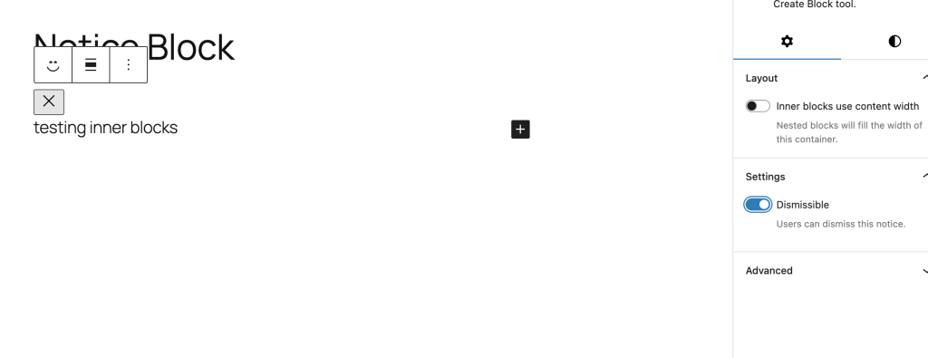
After saving, open up the block editor and set the Notice block to be dismissible. The new button will now appear above the inner blocks:
Yet again though, the saved output needs to be updated to also include this button. So now we’ll head over to save.js and conditionally render the button based on the attribute value.
We’ll need to add a few imports to save.js but ultimately reuse much of JSX we just used in edit.js2:
import { useBlockProps, useInnerBlocksProps } from '@wordpress/block-editor';
import { __ } from '@wordpress/i18n';
import { Icon } from '@wordpress/components';
import { close } from '@wordpress/icons';

export default function save({ attributes }) {
	const { isDismissible } = attributes;
	const blockProps = useBlockProps.save();
	const innerBlocksProps = useInnerBlocksProps.save();

	return (
		<div {...blockProps}>
			{isDismissible && (
				<button
					className="wp-block-lwpd-notice__close"
					type="button"
					aria-label={__('Dismiss Notice', 'lwpd')}
				>
					<Icon icon={close} size="24" />
				</button>
			)}
			<div {...innerBlocksProps} />
		</div>
	);
}
Now when you toggle “Allow dismiss” on and save, you should see the button appear in both the editor and the frontend.
The button doesn’t do anything yet—clicking it in the editor won’t dismiss the notice (and it shouldn’t, that would be annoying while editing). We’ll wire up the actual dismiss functionality in Part 4 when we work on the frontend JavaScript in view.js.
Adding a Data Attribute
Before we wrap up, there’s one more thing we should do. When we write the JavaScript to handle dismissing the notice, we’ll need a way to know which notices are dismissable. We could check for the presence of the dismiss button, but a data attribute is cleaner and more explicit.
Let’s add a data-dismissible attribute to the wrapper when the notice is dismissible. To do this, we need to pass an object to useBlockProps that includes the key data-dismissible). The value will be undefined if it’s not set, so the data attribute will only appear on the element if it is set to be dismissible.
Now, update the variable blockProps in edit.js to the below:
	const blockProps = useBlockProps({
		'data-dismissible': isDismissible || undefined,
});Next update save.js as well:
	const blockProps = useBlockProps.save({
		'data-dismissible': isDismissible || undefined,
});Once both changes are saved, head back to the editor and refresh. You’ll see a block validation error about “Unexpected or invalid content”. This is because the save component is returning different markup than it did when you last saved it (i.e. the new data attribute).
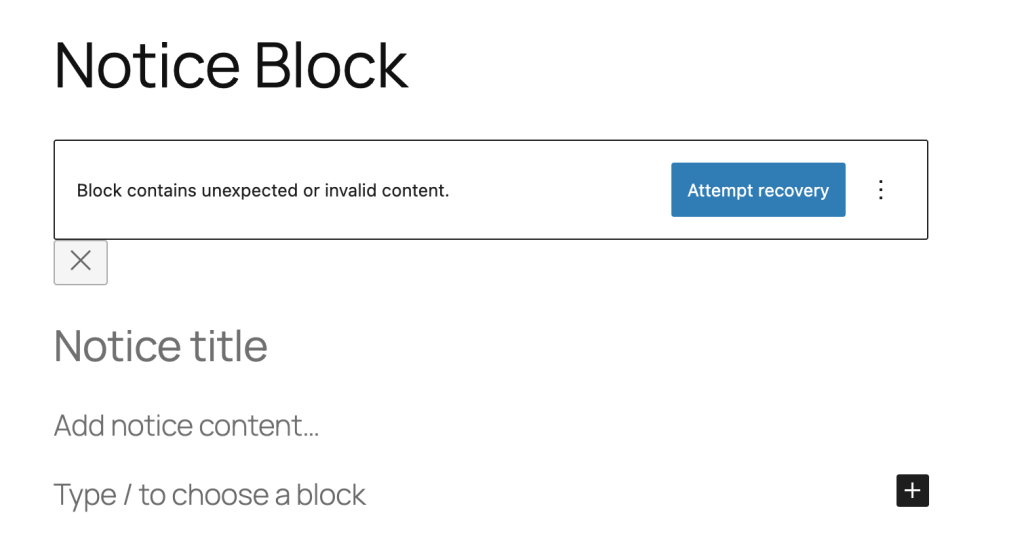
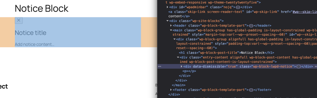
Simply click “Attempt Recovery” and then save the page. The error will go away and the attribute will now be output on the block element if isDismissible is true:
Next Steps
Our Notice block is really starting to take shape. It accepts child blocks, has a clean settings panel, and conditionally renders a dismiss button. In Part 4, we’ll write the frontend JavaScript to actually dismiss the notice and add some basic styles to make it look like a proper notice component.
Further Reading
- useInnerBlocksProps (Block Editor Handbook)
- InspectorControls (Block Editor Handbook)
- ToggleControl (Component Reference)
- Block Editor Components Package
- If you’re using your own icon, make sure the SVG markup uses correct JSX syntax. ↩︎
- Here we’ve just copied that markup vs creating a function or something that retrieves this code. We could do that, but given the small amount of markup it’s probably not worth the extra complexity. The save component doesn’t have access to things that the edit component does. Often times it’s not clean or simple to reuse code between them, but sometimes you can make it work. ↩︎