In Part 5 of Building a Custom Block, we’ll use the Block Styles API to register different visual styles for our Notice block that represent common notice types: info, success, warning, and error.
In Part 4, we added baseline CSS to style our Notice block and wrote frontend JavaScript to handle dismissing the notice. The block looks and functions like a proper notice now, but every notice looks the same by default. If you’ve ever used notice components in any UI framework or design system, you know that different types of notices serve different purposes and should be visually distinct. An error notice should feel different from a success message.
WordPress provides a built-in mechanism for this called Block Styles. Block Styles let you define alternative visual treatments for a block that users can select from the sidebar. When a style is selected, WordPress adds a CSS class to the block’s wrapper element that you can use to apply the appropriate styles. You’ve probably already seen this in action with core blocks like the Image block (which has “Default” and “Rounded” styles) or the Quote block.
Let’s add some styles to our Notice block.
How Block Styles Work
Before we jump into the code, it helps to understand the mechanism behind Block Styles. When you register a block style, WordPress does a few things:
- It adds the style as an option in the Styles panel of the block’s sidebar.
- When a user selects a style, it adds a class to the block’s wrapper element following the pattern
is-style-{name}. - If you’ve marked a style as the default, no extra class is added when that style is active.
So if you register a style with the name warning, selecting it adds is-style-warning to the block’s wrapper. From there, you write CSS that targets that class to change the block’s appearance. If we’re writing our styles without a ton of extra specificity (as noted in previous parts) this allows us to do a lot of styling right away and not have to set a bunch of styles on the block or the blocks inside of it.
Registering Block Styles in block.json
There are a few ways to register block styles in WordPress. You can do it with PHP using register_block_style(), with JavaScript using wp.blocks.registerBlockStyle(), or directly in your block’s block.json file using the styles key. Since we’re building a custom block and these styles are inherent to the block itself, defining them in block.json is the cleanest approach. It keeps everything about the block in one place.
Open up block.json and add a new styles key. This key accepts an array of objects, where each object has a name, a label, and optionally an isDefault flag:
{
	"$schema": "https://schemas.wp.org/trunk/block.json",
	"apiVersion": 3,
	"name": "lwpd/notice",
	"version": "0.1.0",
	"title": "Notice",
	"category": "widgets",
	"icon": "smiley",
	"description": "Example block scaffolded with Create Block tool.",
	"example": {},
	"attributes": {
		"isDismissible": {
			"type": "boolean",
			"default": false
		}
	},
	"styles": [
		{
			"name": "info",
			"label": "Info",
			"isDefault": true
		},
		{
			"name": "success",
			"label": "Success"
		},
		{
			"name": "warning",
			"label": "Warning"
		},
		{
			"name": "error",
			"label": "Error"
		}
	],
	"supports": {
		"align": [ "wide", "full" ],
		"anchor": true,
		"color": {
			"background": true,
			"text": true,
			"link": true
		},
		"html": false,
		"layout": true,
		"spacing": {
			"margin": true,
			"padding": true,
			"blockGap": true,
			"__experimentalDefaultControls": {
				"blockGap": true,
				"margin": false,
				"padding": false
			}
		},
		"typography": {
			"fontSize": true,
			"lineHeight": true,
			"__experimentalFontFamily": true,
			"__experimentalFontStyle": true,
			"__experimentalFontWeight": true,
			"__experimentalDefaultControls": {
				"fontSize": true,
				"lineHeight": true
			}
		}
	},
	"textdomain": "notice",
	"editorScript": "file:./index.js",
	"editorStyle": "file:./index.css",
	"style": "file:./style-index.css",
	"viewScript": "file:./view.js"
}
Let’s break down what each property does:
- name: The identifier used to compute the CSS class. This should be kebab-case if it’s more than one word. The resulting class will be
is-style-{name}. - label: The human-readable label that shows up in the Styles panel. This is what users see when choosing a style. There isn’t a ton of real-estate here so this should be pretty short for best results.
- isDefault: When set to
true, this marks the style as the default. The default style is what’s active when no other style has been selected. Importantly, when the default style is active, no extra class is added to the markup. This is a key detail we’ll come back to when we write the CSS.
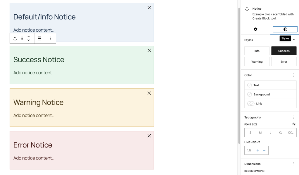
We’ve set “Info” as the default since a generic informational notice is probably the most common use case. The other three (Success, Warning, and Error) will each add their respective class when selected.
Save the file and refresh the editor. Make sure npm run start is going to build as changes are made. When you select your Notice block, you should now see the Styles panel in the sidebar with all four options:

You can click between them and you’ll see the class change in the markup if you inspect the element. But visually nothing changes yet because we haven’t written the CSS for these styles.
Writing the CSS
Now let’s make these styles actually do something. The approach here is to define a set of CSS custom properties (variables) for each notice type and then use those variables throughout our existing styles. This gives us a clean, maintainable way to change the look of the block without duplicating a bunch of CSS rules.
Open up style.scss and let’s update it. We’ll define the default (info) colors on the base class and then override them for each style variant:
.wp-block-lwpd-notice {
	--button-icon-size: 1.5rem;
	--button-padding: 0.5rem;

	--notice-bg: hsl(210deg 50% 95%);
	--notice-border: hsl(210deg 50% 80%);
	--notice-color: hsl(210deg 50% 20%);
	--notice-icon-color: hsl(210deg 50% 40%);

	background-color: var(--notice-bg);
	border: 1px solid var(--notice-border);
	box-sizing: border-box;
	color: var(--notice-color);
	font-size: 1.25rem;
	padding: 1rem;
	padding-inline-end: calc(var(--button-icon-size) + var(--button-padding) * 2);
	position: relative;

  // Success
	&.is-style-success {
		--notice-bg: hsl(145deg 50% 93%);
		--notice-border: hsl(145deg 40% 72%);
		--notice-color: hsl(145deg 50% 16%);
		--notice-icon-color: hsl(145deg 45% 32%);
	}

	// Warning
	&.is-style-warning {
		--notice-bg: hsl(40deg 90% 93%);
		--notice-border: hsl(40deg 70% 70%);
		--notice-color: hsl(40deg 60% 18%);
		--notice-icon-color: hsl(40deg 70% 38%);
	}

	// Error
	&.is-style-error {
		--notice-bg: hsl(0deg 60% 95%);
		--notice-border: hsl(0deg 50% 75%);
		--notice-color: hsl(0deg 50% 20%);
		--notice-icon-color: hsl(0deg 50% 40%);
	}

	&[data-dismissible] {
		display: none;

		&.is-visible {
			display: block;
		}
	}

	&__dismiss {
		background-color: transparent;
		border: none;
		box-shadow: none;
		color: var(--notice-icon-color, currentColor);
		cursor: pointer;
		display: inline-flex;
		padding: var(--button-padding);
		position: absolute;
		right: 0;
		top: 0;


		svg {
			height: var(--button-icon-size);
			pointer-events: none;
			width: var(--button-icon-size);
		}
	}
}Here we’ve added even more CSS properties. Let’s go over why this is helpful.
Why CSS custom properties?

You could absolutely write each variant’s styles out individually. Something like:
&.is-style-success {
	background-color: hsl(145deg 50% 93%);
	border-color: hsl(145deg 40% 72%);
	color: hsl(145deg 50% 16%);
}This works, but it gets repetitive fast. If you later decide to add more properties that should change per-variant (like a left border accent, an icon color, a link color, etc.), you’d need to add the same property to every single variant block. With CSS variables, you define the structure once and just swap the values. This is the same reason we used CSS variables for the button sizing back in Part 4.
What about the default style?
Remember how we said the default style doesn’t add a class? That’s exactly why the base --notice-* variables are defined directly on .wp-block-lwpd-notice without any style-specific selector. When “Info” is selected (or no style is selected at all), those base values apply. The other styles then override those variables using selectors like &.is-style-success.
This is a common pattern: your base styles are the default style, and each variant just overrides what’s different. If you were to inspect a Notice block with the “Info” style active, you’d see just wp-block-lwpd-notice with no is-style-* class. Switch to “Success” and you’ll see wp-block-lwpd-notice is-style-success.
Why HSL?
I’m using HSL here because it makes it really easy to keep the colors within a consistent “family” for each variant. By adjusting the lightness value, you can create background, border, and text colors that all feel related without having to reach for a separate color picker each time. The hue stays the same (210 for blue/info, 145 for green/success, 40 for yellow/warning, 0 for red/error) and you just dial in the saturation and lightness for each purpose.
You could absolutely use hex, RGB, OKLCH, or whatever color format you prefer. HSL just happens to make the relationship between colors in a palette more obvious at a glance. If you’re building a block to be used with a specific theme, then you’d want to use whatever colors and color format you’re using for the rest of the theme (and the theme’s blocks) for consistency.
Testing the Styles
Save style.scss and let the build process do its thing. Now go back to the editor and insert a Notice block (or select an existing one). Open the Styles panel and click between the four options. You should see the colors update in real time:
If you hover over each style option in the panel, the editor will show you a preview of what the block will look like with that style applied. This preview is generated automatically without any extra work needed. This is a nice extra touch that’s great for someone who doesn’t know what the style does already.
Check the frontend as well to make sure the styles look correct there too. Since style.scss loads on both the editor and frontend, everything should be consistent.
Adding a Left Border Accent
The styles are working, but they’re a little subtle. A common pattern for notice/alert components is to include a thicker accent border on one side (usually the left) that makes the notice type immediately recognizable, even at a glance. Let’s add that.
Since we’re using CSS variables, this is a one-line addition to the base styles and zero changes to the variants:
.wp-block-lwpd-notice {
	--button-icon-size: 1.5rem;
	--button-padding: 0.5rem;

	--notice-bg: hsl(210deg 50% 95%);
	--notice-border: hsl(210deg 50% 80%);
	--notice-color: hsl(210deg 50% 20%);
	--notice-icon-color: hsl(210deg 50% 40%);
	--notice-accent: hsl(210deg 60% 50%);

	background-color: var(--notice-bg);
	border: 1px solid var(--notice-border);
	border-inline-start: 4px solid var(--notice-accent);
	box-sizing: border-box;
	color: var(--notice-color);
	font-size: 1.25rem;
	padding: 1rem;
	padding-inline-end: calc(var(--button-icon-size) + var(--button-padding) * 2);
	position: relative;

	&.is-style-success {
		--notice-bg: hsl(145deg 50% 93%);
		--notice-border: hsl(145deg 40% 72%);
		--notice-color: hsl(145deg 50% 16%);
		--notice-icon-color: hsl(145deg 45% 32%);
		--notice-accent: hsl(145deg 55% 40%);
	}

	&.is-style-warning {
		--notice-bg: hsl(40deg 90% 93%);
		--notice-border: hsl(40deg 70% 70%);
		--notice-color: hsl(40deg 60% 18%);
		--notice-icon-color: hsl(40deg 70% 38%);
		--notice-accent: hsl(40deg 80% 48%);
	}

	&.is-style-error {
		--notice-bg: hsl(0deg 60% 95%);
		--notice-border: hsl(0deg 50% 75%);
		--notice-color: hsl(0deg 50% 20%);
		--notice-icon-color: hsl(0deg 50% 40%);
		--notice-accent: hsl(0deg 65% 48%);
	}

	&[data-dismissible] {
		display: none;

		&.is-visible {
			display: block;
		}
	}

	&__dismiss {
		background-color: transparent;
		border: none;
		box-shadow: none;
		color: var(--notice-icon-color, currentColor);
		cursor: pointer;
		display: inline-flex;
		padding: var(--button-padding);
		position: absolute;
		right: 0;
		top: 0;


		svg {
			height: var(--button-icon-size);
			pointer-events: none;
			width: var(--button-icon-size);
		}
	}
}We added one new CSS variable (--notice-accent) and one new CSS rule (border-inline-start). Each variant just sets its own accent color. That’s the payoff of using CSS variables for this kind of thing: one structural change and every variant picks it up.
Note that we’re using border-inline-start instead of border-left. This is a logical property that respects the document’s writing direction. In a left-to-right language like English, inline-start is the left side. In a right-to-left language like Arabic or Hebrew, it would be the right side. If your block will only ever be used on LTR sites, border-left is fine. But using logical properties is a good habit and it costs you nothing.
One other cool benefit is that you can use these types of properties to set borders on a given axis with more ease. We aren’t doing this here because we’re just setting inline-start (aka “left” in LTR languages) but if you wanted to set both sides, you could use “border-inline” to do that.
When to Use Block Styles vs. an Attribute
You might be wondering: couldn’t we have done this with an attribute instead? Like a “type” attribute with enum values?
You absolutely could. And honestly for something like notice types, either approach is valid. But there are a few reasons Block Styles are a good fit here:
Block Styles are visual-only. They add a CSS class and that’s it. If the only thing that changes between variants is the appearance, Block Styles are purpose-built for this. You don’t need to write any JavaScript to handle the selection, display a control, or manage the attribute value. It’s all handled by WordPress.
Block Styles show up in the Styles panel. This is where users already expect to find visual options. Putting it there feels natural and consistent with the rest of the editor experience.
Block Styles include a hover preview. When a user hovers over a style option, they can see what it looks like before committing. This is built-in behavior that you get for free.
An attribute approach would make more sense if the “type” needed to change behavior beyond just CSS. For instance, if an error notice should automatically be non-dismissible, or if a success notice should auto-dismiss after a few seconds, you’d want an attribute that your JavaScript can read and act on. In that case, the attribute drives both the visual style and the behavior.
For our current use case, Block Styles are the simpler and more appropriate choice. If we need behavioral differences later, we can always add an attribute at that point.
Overriding Block Styles with the Color Picker
One thing that’s worth testing is how Block Styles interact with the color support we added in Part 2. If a user selects the “Error” style (which sets a red background) and then also picks a custom background color from the color picker, what happens?
Go ahead and try it. You’ll find that the custom color from the color picker wins. This is because WordPress applies inline styles for color overrides, and inline styles have higher specificity than the class-based styles our CSS variables are setting.
This is actually the behavior you want. Block Styles provide sensible defaults, but the user should always be able to override them. Think of Block Styles as presets: they get you 90% of the way there with a single click, and the individual controls let you fine-tune from there.
If you don’t want users to override the colors for a particular use case, you could remove color support from the block. But in most cases, giving users the ability to customize is a good thing. Block Styles just make the common case fast.
Registering Styles for Other Blocks
Everything we’ve done in this article uses the styles key in block.json, which is specific to the block we’re building. But what if you wanted to add block styles to a block you don’t own, like core/paragraph or core/group?
In that case, you’d use one of the other registration methods. The PHP approach using register_block_style() is probably the most common for themes and plugins:
<?php

function lwpd_register_block_styles() {
    register_block_style(
        'core/paragraph',
        array(
            'name'  => 'highlighted',
            'label' => __( 'Highlighted', 'lwpd' ),
        )
    );
}
add_action( 'init', 'lwpd_register_block_styles' );This would add a “Highlighted” style option to the core Paragraph block. You’d then write CSS that targets .wp-block-paragraph.is-style-highlighted to style it.
You can also pass inline_style or style_handle to the registration function to include the CSS automatically. And if you’re building a block theme, you can even define block styles using JSON files in the theme’s /styles directory (requires theme.json schema v3 and WordPress 6.6+).
For our purposes though, defining the styles in block.json is the right move since they’re part of the block’s own definition.
Next Steps
Our Notice block now has four distinct visual styles that users can switch between with a single click. This is starting to really take shape! In Part 6, we’ll explore block variations: a way to register preconfigured versions of our Notice block that combine a specific style, default inner blocks, and attributes together so users can insert a ready-to-go “Error Notice” or “Success Notice” directly from the inserter.