How Alignments Work in Gutenberg
By Ian Svoboda
Alignments are a key concept that helps you create dynamic blocks with varying container sizes. In this blog post, I break down how alignments work in Gutenberg and share some tips you can use to leverage this capability to write more maintainable themes and build unique interfaces quickly.
How Alignments Work in Gutenberg
What is an alignment?
Alignments are roughly analogous to a “container width” although this isn’t a perfect comparison. Some alignments (Left, Right, and Center) don’t have a maximum width and only add margin to move the block. The following is a list of all current alignment options available at the time of writing:
- Left
- Right
- Center
- Full
- Content (Default)
- Wide
Setting up the Content and Wide alignments
The last two (Content and Wide) are only available if you define what those values are in your theme. If your theme is using theme.json, these values are defined there in the layout key:
{
	"version": 2,
	"settings": {
		"layout": {
			"contentSize": "840px",
			"wideSize": "1100px"
		}
	}
}
The widths you set here can be any valid CSS width, including a CSS variable. Once these are set, the option to use Content or Wide for an alignment will be available on a block that supports those alignments (more on this below). As of Gutenberg 13.7/WordPress 6.1, WordPress will set a CSS variable on the body element for each alignment:
body {
  --wp--style--global--content-size: 840px;
  --wp--style--global--wide-size: 1100px;
}
When a block’s alignment is set, a class will be added to the Additional Classes input for that block for the chosen alignment. For example, if you choose the Wide alignment, the class alignwide will be added to that block.
Inspect the group block on this row and you can see the alignwide class.
Adding alignment support to your blocks
All blocks have a list of features or functionality they “support”. This allows you to make blocks that only opt in to certain settings if desired. Block support is declared when you register the block using any of the available registration methods (PHP or block.json). The current official recommended approach to registering blocks is to use block.json (read more).
To add alignment support to your block, add "align": true to your block.json supports key like so:
"supports": {
  "align": true
}
If you only want your block to support a specific alignment, you can specify an array of alignments instead of just true or false.
"supports": {
  "align": ["wide", "full"]
}
When you add alignment support, an align attribute with the type string is created automatically for the block. You may optionally specify a default alignment if you want (see below). You can read more about block support here.
Setting a default alignment
To set a default alignment you’ll need to add an align attribute to the block with the type of string and then whatever default alignment value you want:
"attributes": {
    "align": {
        "type": "string",
        "default": "right"
    }
}
Adding styles for alignments
For classic themes that are using PHP templates, you’ll need to add your own styles to your theme to make your alignments work. The exact styling you’ll want to use will vary depending on how your own theme is set up, but there are a few things to keep in mind as you set up these styles:
Page Container Size
Not all themes have page containers that go full width. Many will have one or more templates that have constrained page content that doesn’t go the full width of the browser. If you want a block that is set to a full-width alignment to span the entire width of the viewport, you’ll need to use negative margin or other positioning tricks to get the block to be the full viewport width.
This is a full width block.
Content width is not explicitly set
While most alignments are applied when they’re chosen (such as wide, full, left, etc) in the editor for that block. The Content size is the default size of all blocks, so if there isn’t another alignment chosen that block as the Content alignment. This means that you’ll need to write CSS to look for classes that do not have another alignment class and then apply the applicable styles.
Here’s an example:
.page-container > :where(:not([class*="align"])) {
  margin-left: auto;
  margin-right: auto;
  max-width: 800px;
}
In the above example, the :where selector wraps the :not to ensure the selector isn’t overly specific while still excluding blocks that have one of the other alignment classes. The attribute selector matches the string “align” so it will catch any of the other alignments (all of which start with that string). You can read more about the :where() selector on MDN. This is really helpful in the event we need to override these styles later for some reason because the styles will be less specific than they would otherwise.
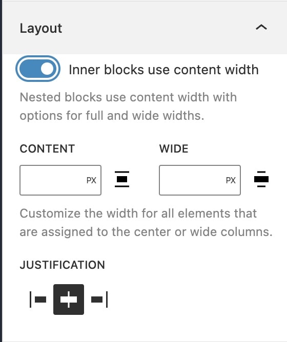
Custom Alignment Values for Group Blocks
Group and Column blocks have a special attribute called Layout that will appear in the event that you have the layout key present in your theme.json file (which is required to add alignments). This allows you to control how the alignments are set inside that particular block.
There are a few potential scenarios where you may want different behavior. By default, you might expect that the inner blocks of the Group block have the same alignment options as top-level blocks do. But then in this one place, you actually want the inner blocks to be full width only just like the Group block you’re setting up, and so on.
You can leverage the Layout attribute for Group blocks to choose how this behavior should be handled. The overview of those choices are:
- You can tell the inner blocks to not use their own alignment and just be the size of the Group block they’re inside of.
- You can allow inner blocks to use the same alignment settings they normally would otherwise while inside that Group Block
- You can specify custom values for the content and wide alignment sizes of the inner blocks of the Group block.
You can read more about this and other layout and spacing options on the fantastic site Full Site Editing.
Happy coding!